A great logo can change how people see your business in just one second. For contractors, a logo is often the first thing a customer notices on a truck, website, sign, or uniform. This guide will show you how to create a strong, clear, and trusted logo that helps you win jobs and stand out from the crowd. If you want a logo that looks professional, feels right, and works everywhere, you’re in the right place.
Why a Logo Matters More Than You Think
Your logo is more than just a picture. It is a sign of trust. When people see a clean and clear logo, they feel safer calling you. Strong logo design for contractors tells customers that you are serious, skilled, and reliable. In busy neighborhoods filled with trucks and signs, a good logo helps people remember you long after you drive away.
Know Who You Want to Attract
Before you draw anything, think about your customer. Are they homeowners, builders, or business owners? Each group looks for different things. Homeowners often want friendly and safe. Builders want strong and skilled. When you know who you want to reach, your logo choices become much easier and smarter.
Keep the Design Simple and Clear
Simple logos are easy to remember. Too many shapes or words can confuse people. A clear logo works fast, even from far away. Think of shapes, not stories. One main idea is better than five small ideas. If a child can understand your logo, it’s probably a good one.
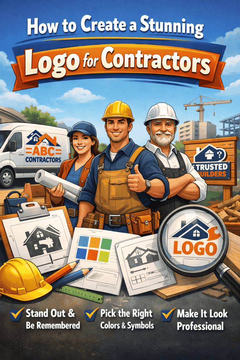
Choose Colors That Speak for You
Colors send feelings without words. Blue often feels trusted and calm. Red feels strong and bold. Green feels fresh and safe. Pick one or two colors only. Too many colors can look messy. Make sure your colors look good on trucks, shirts, and signs, not just on a screen.
Pick Fonts That Are Easy to Read
Your logo text must be easy to read at a glance. Fancy fonts may look nice but can be hard to read from the road. Bold, clean fonts work best for contractors. Make sure the letters are clear in both large and small sizes. If people can’t read your name, they can’t call you.
Use Symbols That Match Your Work
Symbols help people understand what you do right away. A roof, hammer, wrench, or house can work well if used smartly. Avoid using too many tools in one logo. One strong symbol is enough. Make sure the symbol fits your trade and does not feel forced or fake.
Make Sure It Works Everywhere
A great logo must work in many places. It should look good on trucks, websites, hats, cards, and invoices. Test your logo in black and white first. If it still looks good, it will work in color too. A flexible logo saves you money and stress later.
Avoid Copying Other Contractors
It may feel safe to copy what others are doing, but this can hurt you. If your logo looks like everyone else’s, people won’t remember you. Look at other logos to learn what to avoid, not what to copy. Your logo should tell your story, not someone else’s.
Think Long-Term, Not Just Today
Trends change fast, but logos should last for years. Avoid trendy styles that may look old soon. A strong logo should still feel right five or ten years from now. Ask yourself if you would still like this logo as your business grows bigger.
Balance Professional and Friendly
Contractors need to look skilled but also welcoming. A logo that is too harsh can feel cold. One that is too playful may not feel serious. The best logos find a balance. Clean lines, strong shapes, and friendly colors can work together when done right.
Test Your Logo Before You Commit
Before you finalize your logo, get feedback. Show it to friends, family, or even customers. Ask simple questions: “What do you think we do?” and “Do you trust this business?” Honest answers can help you spot problems early and make smart changes.
Why Many Contractors Choose Expert Help
Designing a logo sounds easy, but small mistakes can cost you later. Spacing, color balance, and font choice all matter. This is why many businesses look for logo design for contractors that is built with real-world use in mind. A professional touch can turn a good idea into a great logo.
Mistakes Contractors Should Avoid
Some mistakes are very common. Using tiny details that don’t show up. Picking colors that clash. Using clip art or low-quality images. Or changing logos too often. Avoid these mistakes to keep your brand strong and steady in customers’ minds.
Your Logo Is Part of Your Reputation
Every time your logo is seen, it speaks for you. It shows how much you care about your work. A clean logo suggests clean work. A messy logo suggests rushed work. When people trust your logo, they are more likely to trust your service too.
A Strong Logo Supports Your Marketing
Your logo helps all your marketing work better. Ads, signs, and websites look more professional with a strong logo. It ties everything together. When people see the same logo again and again, they remember you faster and feel more confident calling you.
Final Thoughts on Building a Logo That Wins Jobs
A stunning logo does not need to be complex or expensive. It needs to be clear, honest, and built for real use. When your logo matches your values and your work, it becomes a powerful tool that helps your business grow naturally over time.
If you want a logo that is simple, trusted, and built for contractors, Blue Collar Marketing at bluecollarmarketing.ca focuses on designs that work in the real world, not just on screens.
FAQs
How long should it take to create a contractor logo?
A good logo usually takes time to plan and test. Rushing often leads to mistakes. Taking a few weeks to do it right can save years of regret.
Can I update my old logo instead of making a new one?
Yes. Small updates like cleaner fonts or better colors can refresh a logo while keeping your brand familiar to past customers.
Should my logo include my phone number?
It’s better to keep logos clean. Phone numbers can change, but logos should stay the same. Use contact details on signs and ads instead.