The First Impression Happens in the Bedroom
Before anyone even settles into a bed, their eyes have already decided how they feel about it. The combination of colors, the way the fabrics fall, the quiet cues from a quilt or duvet—they all speak. This is not about chasing trends. It’s about shaping a space that reflects who you are and how you want to feel when you walk in. Your bedding is not just part of your bedroom; it defines the mood, sets the tone, and holds more influence over your rest than you might expect.
A signature bedding look is more than matching sheets and coordinated throws. It takes knowledge, intuition, and a careful balance of color, material, and comfort. It also requires understanding the role each element plays—because aesthetics alone won’t help if your bed leaves you tossing and turning at night.
Start With Color: More Than Just a Shade
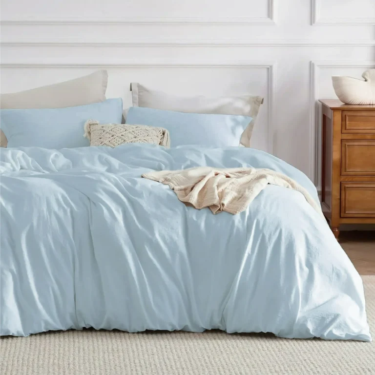
Color doesn’t just decorate. It directs emotion. Certain tones encourage calm. Others energize. A room with soft green bedding tends to feel grounded. A room with crisp white sheets feels clean and open. Deep navy creates intimacy. Pale peach softens the space. Every tone you introduce has a job.
But it’s not just about what looks good together. It’s about how those combinations influence how you sleep, how you relax, how you start and end your day. Pairing a deep base with lighter accents can ground a room while still keeping it fresh. Adding a subtle print to solid sheets introduces complexity without creating clutter.
Pie Chart: Emotional Influence of Popular Bedding Colors
- Soft Neutrals: 34% – Calm and clarity
- Warm Earth Tones: 26% – Grounding and comfort
- Deep Blues: 18% – Security and focus
- Pastels: 12% – Softness and peace
- Bold Accents: 10% – Energy and personality
The color palette of your bed should support the atmosphere you want, not compete with it. And remember, daylight and artificial light both shift how these colors appear—what looks soft in sunlight may deepen dramatically under lamplight.
Fabric Feel: Texture Tells the Truth
Texture isn’t just tactile. It’s visual. A matte linen tells a different story than a glossy sateen. Woven patterns hint at tradition. Brushed cotton says comfort first. A waffle weave on a blanket can make the bed feel layered and inviting without adding more material.
The key is contrast. When all your bedding has the same texture, it looks flat, even if the colors vary. But mix a crisp percale sheet with a quilted cotton blanket and a velvet accent pillow? Now you have depth. And depth is what draws the eye—and the body—in.
Differentiation Bar: Common Bedding Textures and Their Sensory Impressions
| Texture Type | Look | Feel | Comfort Index (0-10) |
| Brushed Cotton | Soft and matte | Cozy and warm | 9.2 |
| Linen | Relaxed folds | Airy and dry | 8.5 |
| Sateen | Smooth sheen | Cool and silky | 7.8 |
| Percale | Crisp flat | Light and cool | 8.0 |
| Velvet Accents | Rich and dense | Plush touch | 6.5 (best in small use) |
Your textures should not only look complementary but feel distinct from one another. This allows you to create visual layering and physical contrast, both of which matter for sensory satisfaction.
Layering Without Overcomplicating
Layering can add dimension and versatility, but many people confuse it with simply adding more. The goal isn’t volume. It’s interaction. A sheet set, a light coverlet, and a quilted duvet are often enough. Each serves a role in both appearance and function.
Use a neutral base and rotate your top layers with the season. A heavier duvet in the colder months. A breathable quilt in spring. The key is building flexibility into your bedding look without making it feel busy or mismatched.
And don’t forget about pillow structure. A sleeping pillow isn’t the same as a support pillow or a decorative one. Each should serve a specific purpose, not just fill space.
Comfort is Still the Final Word
You can get the color scheme just right. The textures can align perfectly. But if the bedding doesn’t feel good, none of it matters. Comfort begins with the material—and ends with how you feel the moment you get under the covers.
Materials like TENCEL, organic cotton, and linen tend to provide both breathability and softness. Avoid bedding that uses coatings to create an initial softness that fades after a few washes. Instead, choose quality fibers that improve with time.
Your skin and body temperature respond to what you sleep on. So even the most beautiful bedding will interrupt your rest if it runs too hot or holds moisture. Comfort is personal, but there are metrics that can help you choose smartly.
Chart: Material Type vs Breathability Score (Higher is better)
| Material | Breathability Score | Durability Rating | Moisture Wicking |
| TENCEL | 9.5 | 8.8 | High |
| Organic Cotton | 9.1 | 9.0 | Moderate |
| Linen | 8.9 | 9.3 | High |
| Sateen Cotton | 7.2 | 7.5 | Low |
| Bamboo Blends | 8.5 | 7.9 | Moderate |
Choosing bedding for comfort means balancing feel, breathability, and how well the fabric adapts to temperature shifts through the night. Don’t be fooled by initial softness—check how it performs over time.
Coordinating Without Matching
Your bedding doesn’t need to match perfectly. In fact, it shouldn’t. Monochromatic sets often look store-bought rather than personal. The art is in coordinating tones and textures that feel related but not identical.
Start with one visual anchor—a pillow, a blanket, or a fitted sheet in a confident hue or print. Then build around that using neutrals or related tones. Keep your palette restrained, ideally within three dominant colors. This approach creates cohesion and avoids visual clutter.
Building Around Your Lifestyle
The best bedding doesn’t just reflect good taste. It reflects how you live. Do you run warm at night? You’ll want breathable fabrics and fewer insulating layers. Share your bed with pets or kids? Durability and easy care should rise to the top.
Even small choices, like selecting a cover that hides pet hair or a weave that resists wrinkling, can add up to a look that stays fresh longer. And if you’re short on time, go for pieces that can be washed and dried quickly without pilling or fading.
Putting It All Together
Designing your own bedding style isn’t about copying magazine spreads. It’s about understanding how each decision—color, material, layering, function—shapes the entire experience. A truly signature bedding look makes you want to walk into your room and lie down. It welcomes you back. It holds your attention without shouting.
It becomes part of your rhythm, your rest, and your sense of place. When color supports mood, texture deepens experience, and comfort becomes non-negotiable, the result is something much more powerful than just a made bed. It becomes the place you never want to leave.